At 256 Pixels, Only One Object or Three Words Survive
By Ansh Khandelwal 7 min read



In brief
ChatGPT ad images can render at 256 pixels square. Learn which subjects, contrast levels and layouts remain legible at minimum size.
Last verified: 12 September 2026 | Version: 1.0 | Next scheduled review: 12 December 2026
The spec is three facts long. PNG or JPG. Square. At least 256 by 256 pixels.
That last one is a floor, not a display size, and the distinction matters less than advertisers hope. Uploading a 1024 pixel square does not mean the reader sees 1024 pixels of anything. It means the file has headroom. The rendered placement is small, and the design decisions have to be made for the small version, because that is the only version anyone looks at.
Almost everything a brand already owns fails at this size. It is worth being precise about why.
The arithmetic of a 256 pixel square
Take a 256 pixel square and put a wordmark across it with sensible margins. You have roughly 220 usable pixels of width.
A ten-character wordmark gets 22 pixels per character. At normal letterform proportions that is a cap height around 30 pixels and a stroke width of two to three pixels. On a high-density display those strokes land on a fractional pixel boundary and get anti-aliased into grey. The word is technically present and practically a smudge.
Now the same square with three words of type set large: "Filed automatically" at 220 pixels of width gets a cap height near 60 pixels and strokes of six to eight pixels. That reads.
The variable is not resolution. It is how many things you asked the square to hold.
What survives, ranked
| Subject | Survives at 256px | Why |
|---|---|---|
| One object, high contrast, filling the frame | Yes | One shape, one silhouette, readable as a blob before it is readable as a thing |
| Two or three words of large type | Yes | Cap height stays above 50 pixels, strokes stay above five |
| A single letter or symbol mark | Yes | It is a shape, not a word |
| A face, close cropped | Usually | Faces are recognised from very low information, but only one face |
| A full logo lockup with tagline | No | Tagline type falls below readable stroke width |
| A product screenshot | No | UI is built for 1200 pixels. At 256 it is grey texture |
| A photograph with two or more subjects | No | Nothing dominates, so the eye gets no entry point |
| A chart or diagram | No | Axis labels and gridlines fall apart first, taking the meaning with them |
| Text over a photograph | Rarely | The photo lowers contrast under the type, which is the one thing type cannot lose |
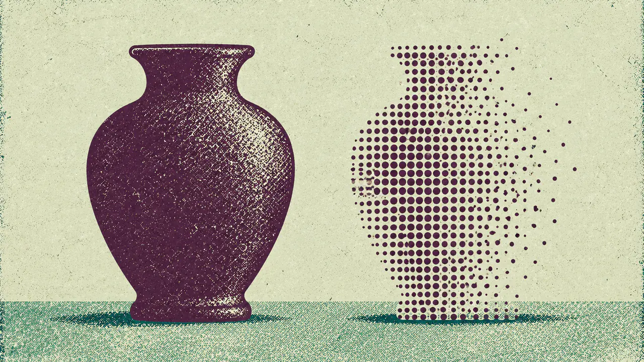
The pattern underneath the table: at this size an image is not read, it is recognised. Recognition works on silhouette and contrast. Everything that depends on the reader's eye moving around the frame fails, because there is no frame to move around in.
Three tests before you upload
The 64 pixel test. Export your image, scale it to 64 pixels square, and look at it at arm's length. If you can still tell what it is, it will survive 256. If it becomes a coloured rectangle, so will the live version to a reader who is not looking for it.
The greyscale test. Desaturate it. If the subject stops separating from the background, you were relying on colour contrast rather than tonal contrast. Colour contrast is the first thing lost to compression, dark mode surrounds and cheap displays.
The one-thing test. Say out loud what the image is of, in one noun phrase. If the sentence needs an "and", cut something.
What to actually make
Three formats cover nearly every B2B advertiser.
The single object. One physical thing your product relates to, shot or illustrated against a flat contrasting ground, filling 80 percent of the frame. Works when the product has a physical correlate: a payslip, a key, an invoice, a van.
The type card. Two or three words, set large, high contrast, no photograph underneath. This is the format nobody wants to make because it looks unbranded in the design review, and it is the format that reads. Note that it also duplicates your headline if you are not careful: use the type card to say the thing the headline cannot fit.
The mark. Your symbol, not your full logo, on a flat ground. Only worth doing if the symbol is already recognisable to your buyer, which for most B2B companies it is not.
Everything else is a brand asset that happens to be square.
The honest limit of this argument
Every claim above is reasoning from legibility, not measurement of performance. It is the physics of small images and human vision, applied to a documented minimum size.
What it is not: evidence that any of these choices produce better click-through or lower cost per acquisition in ChatGPT Ads. OpenAI publishes no creative performance data, no image benchmarks, no guidance beyond format and minimum dimensions. No advertiser has published a controlled image test on this placement. InPromptAds has no first-party campaign data.
So the sentence to hold onto is narrow: a reader cannot respond to an image they cannot resolve. That is true, and it is a floor rather than a strategy. Above the floor, whether a single object beats a type card for your category is an open question, and one you can only answer by running both as separate ads in the same ad group, since ad-level reporting is the finest grain available.
What we cannot tell you
- The actual rendered display size of the image. OpenAI publishes a 256 pixel minimum, not a render size, and it may differ by surface and by device density.
- Whether image choice affects CTR on this placement. No published test, no OpenAI benchmark, and no first-party data of ours.
- How the image renders in dark mode. Undocumented, and a flat white ground behaves very differently from a flat dark one.
- Whether image compression is applied after upload. Not documented, which matters for fine type and gradients.
- Whether any image style affects ad approval. Approval criteria for creative are documented only in general policy terms.
Quick answers
What size should a ChatGPT ad image be? Square, PNG or JPG, at least 256 by 256 pixels. Upload larger for headroom, but design for the small rendering, because that is what the reader sees.
Can I use my logo as the ad image? A symbol mark, yes, if your buyer already recognises it. A full logo lockup with a tagline, no. Tagline type falls below readable stroke width at this size.
Do product screenshots work as ChatGPT ad images? No. Interface elements are designed to be read at around 1200 pixels of width. Compressed into a 256 pixel square they read as grey texture with no entry point.
How much text can go in the image? Two or three words at a size that keeps cap height above roughly 50 pixels. Use them to say something your headline could not fit, not to repeat it.
Is there data on which images perform best? No. OpenAI publishes no creative performance data for this placement and no advertiser has published a controlled test. The arguments here are legibility reasoning, not measured results.
How do I test an image before spending? Scale it to 64 pixels and look at it at arm's length, desaturate it to check tonal contrast, and describe it in one noun phrase without using "and".
Sources
| Claim | Source | Tier |
|---|---|---|
| Ad image must be PNG or JPG, square, at least 256 by 256 pixels | OpenAI Ads Manager documentation, 2026 | Confirmed, primary |
| Creative consists of brand name, logo, headline, description, image and destination URL | OpenAI Ads Manager documentation, 2026 | Confirmed, primary |
| No rendered display size, compression behaviour or dark mode behaviour is published | OpenAI documentation, by absence | Absent |
| No creative performance benchmarks exist for the placement | OpenAI documentation and trade press, by absence | Absent |
| Legibility thresholds, the ranked subject table and the three pre-upload tests | InPromptAds reasoning from the documented minimum size | Inference, ours |
Related reading
- ChatGPT Ad Format
- ChatGPT Ads Specs
- Write the 16-Character Headline First, Then Earn the Other 34
- ChatGPT Ads Checklist
- How Many Ad Variations Per Ad Group, and What the Difference Teaches You
Changelog
12 September 2026, v1.0. First publication. Argues image subject choice from legibility at the documented 256 pixel minimum, and states plainly that no performance data exists for this placement.
Field kit
Tools
Site
OpenAI (primary)
Ansh works across GEO strategy, B2B research, and execution. At InPromptAds, he translates new AI advertising products into clear operating advice, tests, and measurement questions for marketing teams.